An Inventory Quandary: Three Theories for Why People Are Moving Less
- Americans are moving less than at any point in recent history: If American homeowners moved at the same rate they did in 1990, there would have been about 2.8 million more homes sold in 2016.
- Young adults still move more often than older ones – but their pace has slowed. Population aging has only been a modest weight on overall moves.
- The growth of single-family rental homes has likely contributed to lower owner-occupied turnover in some markets.
Anyone who has shopped for a home in recent years knows that inventory is tight, with first-time home buyers, in particular, having a hard time finding homes that fit their needs and their budgets. There are lots of reasons for low inventory, but one main culprit could be flying under the radar: Americans simply aren’t getting a move on like they used to, which has sweeping implications for the U.S. housing market.
When people move less, fewer homes become available for sale and for rent. If American homeowners moved at the same rate they did in 1990, there would have been about 2.8 million more homes sold in 2016.
We explored three possibilities for the relatively recent shift in domestic migration:
- An aging population
- Pockets of high negative equity
- An increase in single-family home rentals
Among the three considered, the last factor carries the most weight.
Not Getting A Move On
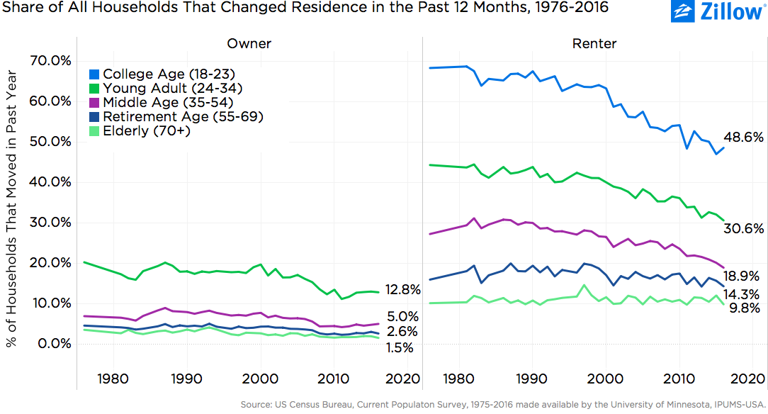
The migration rate – the share of Americans who change residence in a given year – has declined by 6 percentage points since 1990, to 10.8 percent. In the late 1980s, more than one in six American adults moved each year; by 2016, only about one in 10 had moved over the previous year. If the migration rate were the same in 2016 as it was in 1990, 17.1 million more Americans would have moved last year – meaning 43.5 million movers. Instead, 26.4 million people actually did move.
At the household level, the migration rate dropped from 17.4 percent in 1990 to 11 percent in 2016. If the rate were the same as in 1990, 8.1 million more American households would have moved in 2016. Looking only at owner-occupied households, the migration rate nearly halved between 1990 and 2016, from 7.7 percent to 4.2 percent. Among homeowners, it appears as if there was a structural shift in mobility during the 2007-2009 recession. For both young-adult and middle-aged homeowners, the migration rate was relatively steady from 1985 through 2005, then dropped between 2005 and 2008 for middle-aged homeowners, and between 2005 and 2011 among young adult homeowners. Since then, migration rates for both groups have been relatively steady or even slightly recovering.
So, what changed structurally between 2005 and 2011? Here are three possibilities:[1]
- Less youthful mobility
Some of the decline in mobility is driven by an aging American population: Older adults move less frequently than younger adults. Although the gap in mobility rates across age groups has narrowed, young adults remain about four times more likely to move in a given year than older adults. People are moving less frequently across all age groups, but young adults (ages 24 to 34) saw the greatest migration rate decline (from 28.5 percent to 20.7 percent) between 1990 and 2016 than the rest.
However, aging has been a relatively modest weight on the recent overall slowdown. The shifting age profile of the American population explains only about one-fifth of the decline in the aggregate migration rate since 1990.
A falling homeownership rate has moderated the demographic headwinds of aging on the migration slowdown. Renters of all ages move more frequently than their homeowner peers, and over the past decade, renters have accounted for the vast majority of all new households. But the shift has not been enough to offset falling migration rates for all but the oldest renters. Young adult renters today are now about as likely to move in a given year as middle-aged renters were a generation ago. For homeowners of all ages, the migration rate dropped sharply during the recession, but has since stabilized – or, in the case of young adults and middle-aged homeowners, drifted slightly higher. If the homeownership rate had been stable, the migration rate would have declined to 10.3 percent (instead of 10.8 percent) from 15.3 percent in 2000.
- Negative equity
Another possible reason for the decline in homeowner moves is negative equity. As home values fell during the housing bust, many homeowners found themselves living in homes worth less than their outstanding mortgage. Some of these people likely refrained from moving – or were outright unable to move – until home values recovered sufficiently to regain equity.
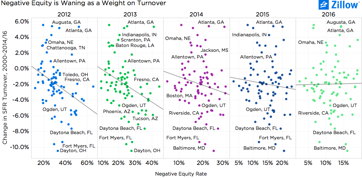
When comparing the magnitude of the structural shift in turnover[2] of single-family homes to the average negative equity rate across metros, it is clear that in 2012 and 2013, negative equity did weigh on turnover: Markets with higher negative equity rates experienced a larger drop in single-family home turnover. After 2013, that relationship gradually broke down, so that by 2016, there was essentially no relationship between the negative equity rate and the single-family home turnover rate.[3]
We saw similar results when looking at ZIP codes within the 100 largest metros nationwide. In past years, ZIP codes with higher negative equity rates experienced larger drops in turnover. But as of 2016, that’s no longer the case nationwide (on average). But there are some markets that prove exceptions to the rule. Minneapolis is a good example: Across ZIP codes in the Twin Cities, a 1 percentage-point increase in the negative equity rate corresponds to a 1.6 percentage-point-larger drop in the single-family home turnover rate. Metros in which negative equity continues to weigh most on local turnover include: Baltimore; Washington, D.C.; Miami; Orlando, Fla.; Tucson, Ariz.; Riverside, Calif.; Tampa, Fla.; Boston; Minneapolis; Phoenix; Cincinnati; and Chicago.
But while negative equity could help explain why the migration rate dropped during the housing bust, it cannot explain why the migration rate has remained stubbornly low during the housing market recovery.
- Single-family home rentals
A third possible explanation for the decline in migration has to do with the shift many people made during the housing crisis from owning single-family homes to renting them.
As home values dropped rapidly in some markets during the worst months of the housing bust – and as foreclosures mounted – investors began to purchase many foreclosed, formerly owner-occupied homes and convert them into rentals. At the time, especially in very hard-hit places like Las Vegas, Phoenix and Riverside, investor purchases were an important and timely source of demand in a market experiencing free falls in home values. Their activity began to turn around local markets.
Since the recession, the share of American single-family homes that are rented has increased steadily, from 12.7 percent in 2005 to 19.2 percent in 2016. Between 2005 and 2016, the number of owner-occupied single-family homes fell by 680,000, while the number of renter-occupied single-family homes increased by 6.2 million.
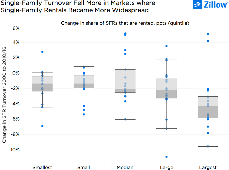
As rental homes, these properties are put up for sale less frequently – creating both more options for renters and fewer for buyers. Markets that experienced the largest increases in the share of rented single-family homes between 2000 and 2015 also saw the largest drops in single-family home turnover. On average between 2000 and 2016, the singe-family home turnover rate fell 4.2 percentage points in markets with the largest increase in the share of single-family homes being rented. However, turnover still fell – by 1.3 to 1.4 percentage points – in markets with the smallest changes in the share of single-family homes that are rented.
The shift in single-family homes being owned to rented has likely been an important contributing factor to declining single-family home turnover – particularly in the 20 percent of markets with the largest shift in owned houses to rented houses. But it still cannot fully explain the extent of the mobility slowdown, for a few important reasons:
- The change in the share of single-family homes that are rented explains only about 9 percent of the cross-metro variance of the change in the single-family home turnover rate. While the relationship is statistically significant, it is not particularly powerful.
- Single-family home turnover fell meaningfully even in places with a negligible change in the share of homes that are rented; some other forces must also have pushed the turnover rate downward. It is noteworthy that the magnitude of the decline in turnover in markets with relatively little investor activity is roughly on par with estimates of the effects of aging on mobility nationwide.
Overall, the shift of single-family homes from the owner-occupied to the rental-occupied housing stock is a strong candidate to explain the structural shift in single-family home turnover, above and beyond the relatively minor demographic headwinds from aging.
Related:
- Tight Inventory, Rapid Price Growth Represent Real Headwinds for The Market’s Core
- Preaching Patience: What’s the Best Time of Year for Home Buyers?
- Without Spending More, Some Renters Could Likely Afford to Buy Above-Average Homes
[1] In the subsequent analysis we focus on single-family homes – which account for about 90 percent of home sales nationwide – and use Zillow’s single-family home turnover metric (share of homes sold in the past year) as a proxy for the migration rate. The turnover rate is a close proxy for the migration rate among single-family households and allows greater geographic detail.
[2] Percentage point change between the 1998-2003 average and the 2014-16 average, with the period 1998-2003 corresponding to a period of stable markets before the housing bubble.
[3] From 2014 onward, we also found no relationship across metros when examining effective negative equity – including those homeowners with less than 20 percent equity in their homes – and the change in single-family home turnover.