Tableau Iron Viz 2017: Zillow Data Three Ways (Download the Dataset)
- Find out how to download the dataset here. See instructions below.
The Tableau Iron Viz 2017 competition at Tableau’s annual conference in Las Vegas this fall culminated in an animated finale with three data visualization experts competing to create the most compelling data story.
The contestants – Joshua Milligan of Teknion Data Solutions, Tristan Guillevin of Actinvision and Jacob Olsufka of Decisive Data – were given 20 minutes to analyze and visualize the secret dataset and present their work to a panel of judges and an audience of 14,000.
Zillow provided this year’s dataset, which featured 150 million rows of housing data covering five geographic granularities and 18 metrics over 25 years. It presented a challenge for the contestants on both analytical and design fronts.
These are questions and answers from the competitors, along with the data stories they created:
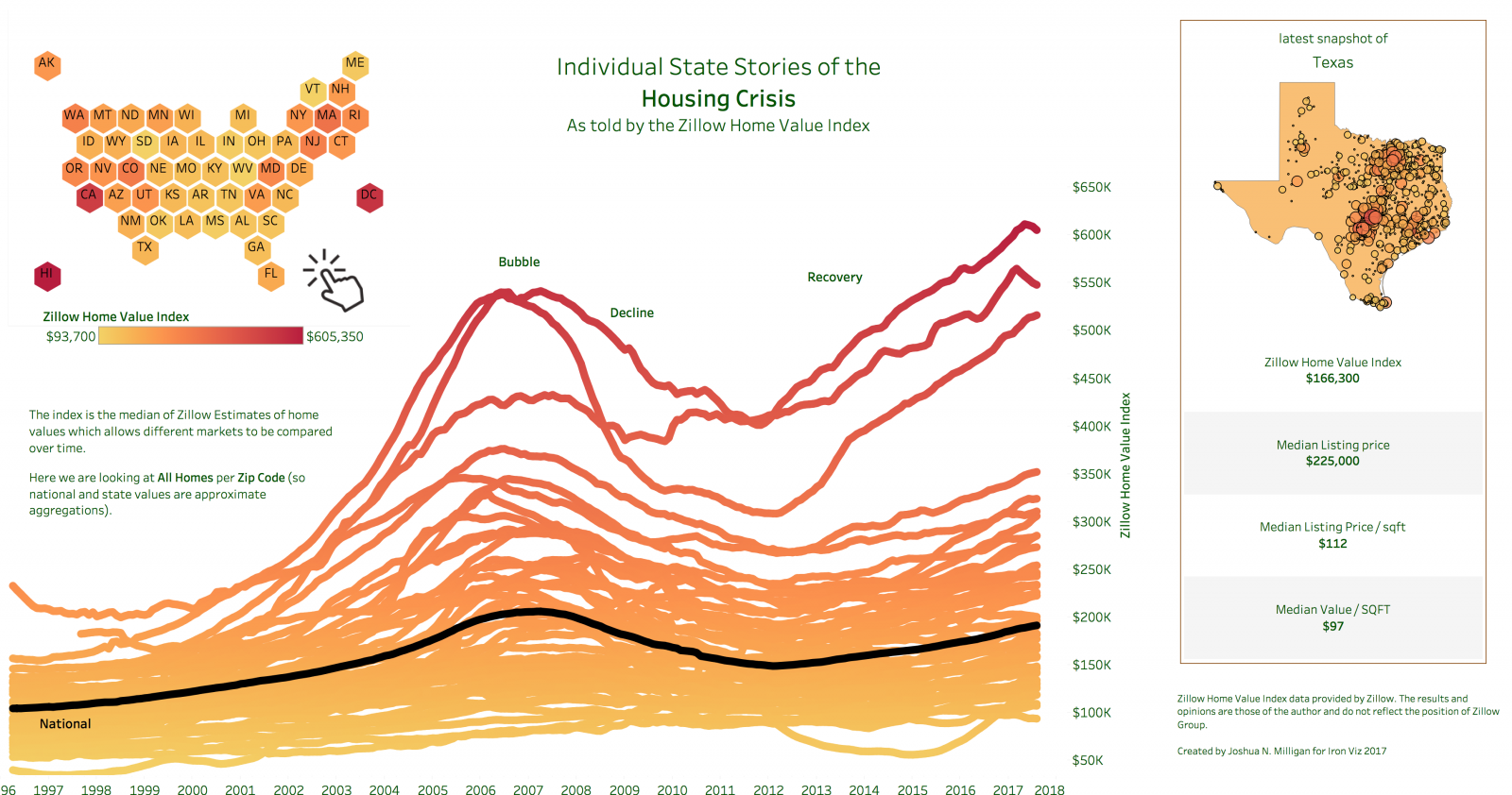
Joshua Milligan
Tableau Zen (and game) master Joshua Milligan focused on median home values across different levels of geography, drilling down into housing stories in every state. While he pointed out the national median home value with a black line on his dashboard, he noted that there were thousands of stories to tell within this data set.
Q: How did working with this data set different from other data sources you’ve worked with?
A: Every data set has its own flavor. This one, at first, was a bit daunting. Not only because at 150 million records it’s a fairly good-sized data set, but also because the structure was unique. There were multiple measures contained in a single field, and the geography hierarchies were also originally stored in a single column. But once I was used to the structure, I began to see how rich the data truly was. There were multiple stories to be told and numerous insights to uncover.
Click to interact

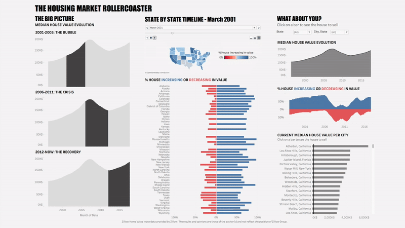
Tristan Guillevin
First-time Tableau Conference attendee Tristan Guillevin illustrated his housing story in a three-paneled, animated dashboard. The left panel was a big-picture look at the housing crisis, the middle section showed a state-by-state overview animated over time, and the last panel showed city level information. Tristan embedded links into tooltips so that house hunters could use the last panel to find a home on Zillow.com. His challenge included not being familiar, as a Frenchman, with U.S. city names.
Q: Did you find anything during your exploratory analysis that surprised you?
A: Jade [Tristan’s assistant from Tableau] spoke about it during the competition I think: the number of cities with the same name. At the beginning, I was showing cities data without the state information, and the values were always wrong. After some time, I realized that a lot of cities have the same name! Except that, it’s hard to say that I was surprised. Everything was new. I don’t know any history about a particular state or city. So it was more a lot of discoveries and learnings.
I decided not to fool the audience about the amount of things I know about the U.S. housing market and just tell a story that me and my family could easily understand.
Click to interact

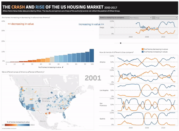
Jacob Olsufka
Jacob Olsufka used a histogram to depict a national story about the crash and recovery of the U.S. market over the past two decades. During the live demo, Jacob used Tableau’s Pages Shelf to play through his dashboard and hard-coded spark lines to call out trends in cities of interest.
Q: How did you decide to use the Pages Shelf and animate the viz?
A: For a while, I have been experimenting with leveraging animation to enhance the data storytelling experience. I’ve found that effective use of data animation can be a more memorable, engaging, and impactful way to tell a story.
I first watched my animated distribution chart using the Pages Shelf and loved how this clearly showed the dramatic shift of the housing market during the crash, and then the subsequent recovery. When I saw this, I knew that was the story to tell and created the map to accompany this chart.
Click to interact

All three contestants showed an incredible ability to communicate data stories quickly, but ultimately Tristan’s three-panel story won over the the judges and the audience to become the Iron Viz 2017 winner.
What can we expect next from Tristan? “I’m starting a blog; it’ll be available soon. Now, I have a bit more followers on Twitter than before, so it’s probably the best time to start sharing my knowledge and some advice. Start to give back to community, because a lot of people helped me during the last two years.”
Explore the data
Download the housing dataset used in the Iron Viz competition.
- Download the .tds
OR
- Visit exasol.com/dataviz and sign up for access.
- Download and install the OBDC driver.
- Open Tableau and connect to the Exasol database.
- Enter your username and password.