The Best Colors for Each Room in Your Home, According to a Color Expert
An interior designer explains how to be intentional with color to boost your mood in every room.
Written by Alexis Benveniste on June 16, 2023
The colors you choose when decorating your home or apartment can alter your mood, for better or for worse. They may make you feel more productive or creative in your kitchen, or more relaxed in your living room. Choose the wrong color, and you may literally lose sleep over it.
This school of thought is part of a broader concept called color psychology, the study of how colors affect human emotions and behavior. Color psychology principles are the foundation for designer and color expert Mehnaz Khan’s work with her clients on transforming their homes — and feeling their best in them.
“Color psychology is an alternative medicine,” says Khan, who explains that using colors wisely in her own home helped her overcome seasonal depression. “We live in a world where everybody's trying to play it safe. Colors have a psychological impact on us. They're not just about décor and beautifying things.”
A room’s function and purpose is important when considering colors, according to Khan. She asks her clients how they want to feel in particular spaces in their home and what time of day they use that specific room. From there, she creates a custom color palette intended to leave clients feeling their best.
We asked Khan how to be intentional with color in almost every room in the house. While Khan’s advice isn’t intended to be one-size-fits-all for every homeowner or renter, let it inspire you the next time you’re at your favorite home décor shop, the thrift store or in the paint aisle.
Best colors for each room
Bedroom
The bedroom is meant to be a calming and soothing space that promotes sleep and relaxation. In this room, Khan says, it’s important to focus on “low-intensity colors,” shades that are less-saturated, and thus tend to be less stimulating. Low-intensity colors, like light green and light blue, can help you create and foster a relaxing environment. Go with these shades for your walls, especially if you have a hard time falling asleep at night. If you’re renting and painting isn’t an option, you can incorporate these colors into the next biggest focal point of your room: you’re bedding.
Red, on the other hand, is a no-go. Red — especially highly saturated, bright red — is an activating color, which means it can make you feel hyperactive, according to Khan. Save ruby and rose tones for rooms in the house where your goal is to stay alert and energized.
Bathroom
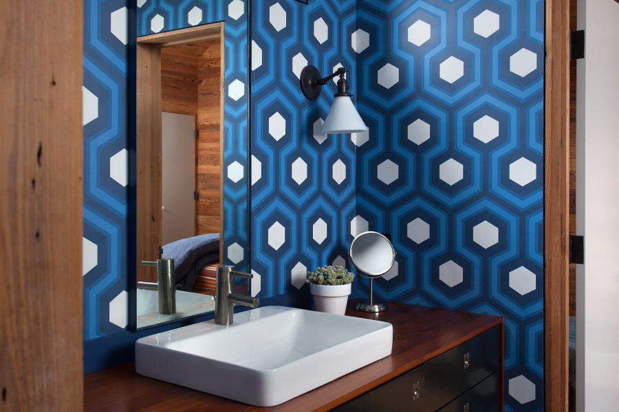
There’s more than one answer when it comes to choosing colors for your bathroom. If you’re painting a kid’s bathroom and you’re looking to create an environment that will help them wake up and feel alert in the morning, go with a bright, fun color, like turquoise. However, if you're looking to create a spa-like ambience that helps you unwind, Khan recommends incorporating dark blue or purple colors into your bathroom.
If you don’t have any specific vision for the type of environment you want to create in your bathroom, whites and other neutrals are a safe choice. They give the bathroom, a space that tends to be one of the smallest rooms in your home and filled with products, a clean, streamlined look, Khan says. Consider white if you’re the type of person who gravitates towards a more minimalist style or you are generally looking to create more order for yourself.
Kitchen
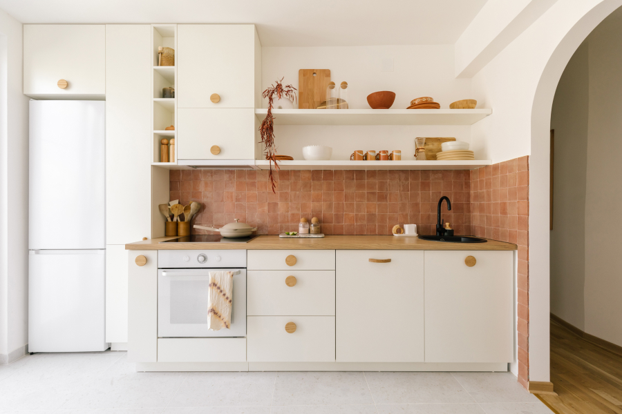
“The activity that happens in the kitchen — cooking — is very physical and emotional,” Khan says. While red may keep you up late at night in a bedroom, Khan says it’s perfect for the physical activity that takes place in your kitchen. Looking to take your cooking game up a notch? Consider pairing red with yellow, a color associated with feeling happy and energetic, she says.
If red feels a tad too high intensity, Khan recommends going with a light shade of yellow or white for your kitchen walls, but then integrate bright yellow and red accents into your countertop kitchen appliances to boost your mood.
Khan recommends avoiding the color blue in kitchen décor. “The color blue kills the appetite,” Khan says, adding that it’s important to look at which colors are prominent in nature. “Nature has not created blue food.”
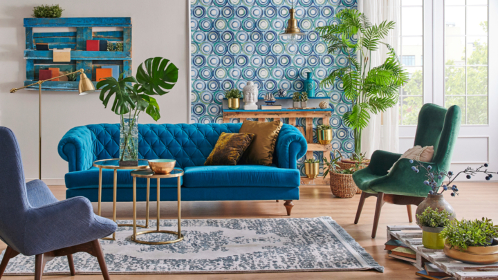
Living Room

When picking paint colors for rooms where you spend a lot of time — like the living room — it’s natural to play it safe and opt for all neutral everything, and that’s not necessarily a bad thing. Khan compares using color wisely to eating a balanced diet that includes veggies, protein and carbs. There’s nothing wrong with leaning on white or gray for your focal points in the room, like a sofa, if you’re open to experimenting with pops of color in the other details and accents.
In fact, you may want to think twice before committing to that pop of color in your couch, Khan suggests — you don't want to have to change your sofa every two years when you get sick of it.
Playing around with colorful pillows, however, is encouraged. For example, if you’re a fan of red, decorate a neutral-toned sofa with one or two red pillows. “Doses really matter,” Khan says, highlighting that it’s not only important to pay attention to how much color you use, but where you’re using it. A colorful rug on the floor, for example, tends to have less impact on your mood versus a paint color on the wall because it's below eye-level.
If you're feeling more confident about incorporating color, try green in the living room. Green is a great choice for creating an inviting and comfortable space, Khan says, because “it’s balancing and relaxing, and it connects us to nature.”
Dining Area

Your dining space, whether it's a room or a nook in the corner of your living room, is where you gather with friends and family to connect over meals and conversation, so it should feel inviting and warm. Khan again recommends leaning on green and integrating doses of red, yellow and orange to create a welcoming atmosphere. And like the kitchen, you’ll want to avoid the color blue in your dining room, Khan says.
Home office
If you’re looking to use your work space at home as a place to stay grounded, zone in and focus, go with the color blue. “Blue is the color of intellect,” Khan said. “It engages the mind.”
She recommends balancing out the distribution of high-intensity and low-intensity colors. High-intensity blues — like cobalt and turquoise — are brighter, and therefore, more stimulating, whereas low intensity blues — like sky blue and periwinkle — are more relaxing.
If you’re looking to enhance your productivity, Khan recommends introducing high-intensity blues in a home office. However, she suggests avoiding extremely dark blues, like navy, because it can make your space feel too claustrophobic. Want to help stimulate creativity? Khan says to find ways to add bursts of yellow, orange and pink into your office.
Ultimately, picking the colors for the rooms in your home can and should be fun. It’s a process that allows you to tap into your creativity. Give yourself the time and space to think about what mood you want for each room, and let your mind run wild from there.
Tags
Find an apartment you’ll love on Zillow
With Zillions of up-to-date listings and filters for your must-haves, it's easy to find your perfect apartment on Zillow Rentals.
Search rentalsRelated Articles

Stay on track with Renter Hub
Save your favorite rentals, message landlords, track your application status, create a free renter profile and more - all in your Renter Hub
Visit your hub