Birth Rates and Home Values: A Closer Look
Don’t people in pricey places always have fewer children? Doesn’t prior research show a positive relationship between home value gains and greater fertility? And more questions answered!

Don’t people in pricey places always have fewer children? Doesn’t prior research show a positive relationship between home value gains and greater fertility? And more questions answered!
In a recent research brief, Zillow brought attention to the surprising continued decline of Americans’ birth rates, despite the strong economic recovery since 2012. The post garnered a number of follow-up questions on social media and elsewhere, which I’m returning to address after, coincidentally, taking leave when my first child was born. Zillow Research also just published a new look at Census and Zillow data that shows that for many people, the decisions to move and to have kids are intertwined.
Yes, but what the first research brief investigated is not the cross-sectional correlation of birth rates and home values, but the post-recession percentage changes in each variable. Today, cities like New York, Los Angeles, and San Francisco are known as destinations for highly-educated young people who may be more likely to delay family formation, but that was true in 2010 as well.
The new finding is that counties that already had low birth rates for young adults in 2010 saw their birth rates plummet further, and the degree to which they did was correlated with the degree to which their home values rose. Focusing on just the changes in home values and birth rates across counties helps to control for long-standing differences in these places.
Below are two snapshots of counties’ 25- to 29-year-old birth rates, separately in 2010 and 2016, charted against their home values. What the original brief reflected is the fact, observable in these two charts, that the negative relationship became more pronounced between 2010 and 2016. A crude way to measure this is the increase in R2 between the two points in time, from 0.15 to 0.23:
One way to explain both these facts is that the “Big Sort” of people into different types of cities has accelerated since the great recession: some people are shifting toward very expensive housing markets requiring high-pay careers with belated or reduced childbearing, while others gravitate toward housing markets where it is more affordable to have children and buy a big enough house for the whole family. Against that background, people moving to more affordable areas will have more children and those in less affordable areas will have fewer, even by historical standards.
While the negative cross-sectional relationship was well-known, previous research actually showed a positive relationship between changes in home prices and birth rates. A recent, excellent article on the subject in the Journal of Public Economics by Lisa J. Dettling and Melissa S. Kearney, economists at the Federal Reserve Board and at the University of Maryland, found as its headline result that a $10,000 home value increase was associated with a 0.8 percent increase in fertility. This was derived from their more nuanced findings that non-homeowners have fewer babies in response to higher prices, while existing homeowners raise their birth rates.
Their estimates found a tipping point: For groups and times when homeownership is below about 32.4 percent, rising home values do, in fact, depress birth rates. In 2016, the nationwide homeownership rate among people aged 25 to 29 was 30.9 percent, after falling every year since 2006. In other words, falling births for this group in response to rising home values would now be consistent with Dettling and Kearney’s findings.
I focused on the changes in birth rates for 25- to 29-year-old women because younger people are often more affected by the challenge of housing affordability, and their birth rate dropped the most in absolute terms of any age group, from 2010 to 2016. The below chart shows that their birth rate did indeed rise through the housing boom until 2005, alongside their homeownership rate, and then both rates fell in tandem since then.
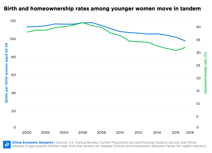
The homeownership rate and birth rate were very closely correlated since 2000, with a correlation of 0.96, over this time frame. This reinforces the finding by Dettling and Kearney that the homeownership rate is critical for understanding how home values impact birth rates.
The chart also shows how the two periods of rising home values (2000 to 2006, and 2012 to 2017) were experienced in very different ways by people in their late 20s. In the 2000s, rising home values were accompanied by an expansion of access to homes, as more young people than ever before entered homeownership. The current home value run-up, by contrast, has mostly left young Americans behind, and many more of them now experience rising home values as an obstacle to homeownership rather than as a wealth-building boom. The reasons are myriad and outside the scope of this brief, but they may include the rise in student debt necessitated by the high costs of college; tight lending standards including large down payments, which are especially unaffordable to young, first-time buyers; new home construction lagging population growth for over a decade; and the rise of mass ownership of single- family rental homes by institutional investors, which bought up much of the affordable, distressed inventory left over after the housing crash.
Another question raised by the first research brief was how much of the changing birth rates could be attributed to the changing composition of these large counties’ populations: Perhaps each demographic group was having babies at similar rates to 2010, but the proportions of each group were changing.
The most commonly hypothesized reason for changing demographics was migration – that those people having babies or planning to have them would move away, and especially move to lower-cost counties. In a separate brief diving into this question, I found that it is true that families having babies are more likely to move, and that they are more likely to move to cheaper areas than other families.
However, the effect on a large county’s birth rate would be small, because only a small fraction of such families with a woman aged 25 to 29 who gave birth in the past year move at all in any given year — and almost as many families of that same description move in the opposite direction, to more expensive areas. The migration hypothesis also could not explain the nationwide trend of much lower birth rates since 2011, which prompted the research in the first place. Finally, that hypothesis would suggest birth rates should have risen a great deal in lower-home-value counties, when in fact they fell in most of them.
Another spin on the changing composition hypothesis focused on the gentrification of big cities, as wealthier demographic groups with lower birth rates took the place of lower-income groups with high birth rates. Especially in California, home to several of the counties with the biggest drops in birth rates, this might take the form of non-Hispanic ethnic groups rising as a share of population while the Hispanic share shrank. To investigate this possibility, the below chart shows how birth rates for 25- to 29-year-old women would have changed if each county had the same ethnic composition as in 2010, but each ethnic group changed their birth rate as was actually observed. The result is effectively no different from what actually happened:
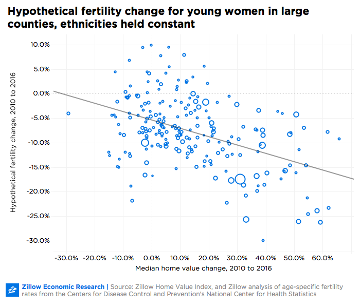
The coefficient on home value change actually grew slightly in magnitude to -0.17, and the R2 increased somewhat to 20 percent, but overall this is very similar. That is likely because all ethnic groups had declining birth rates in the studied time period.
While the correlation of rising home values and falling homeownership with falling birth rates for young adults is far from proving causation, they remain suggestive of a relationship, and may help to illustrate the challenges facing today’s young adults considering starting or growing their families.
Methodology: This analysis relied on the Zillow Home Value Index (ZHVI), and age-specific fertility rates from the Centers for Disease Control and Prevention’s National Center for Health Statistics. Counties with fewer than 10,000 women were excluded from the regression to reduce noise. Several different specifications were tested for robustness and yielded similar results.
