- Boston has the most expensive downtown area for homeowners among metro areas analyzed. Homes within a 15 minute commute of downtown Boston cost 303 percent more per-square-foot than homes in the rest of the metro.
- Washington, D.C., and San Francisco have the most expensive downtown areas for renters, with rent per square foot more than twice as high within 15 minutes of downtown as in the rest of the region.
- Centrally located homes in five metro areas – Detroit, Baltimore, Cleveland, Kansas City, and Indianapolis – sell at a discount compared to the rest of the region.
In most of the nation’s almost three dozen largest metro markets, owning or renting a home close to downtown is a prize worth paying for. But in some, this proximity is a penalty. And the divide says as much about our evolving housing preferences as it does the current state of America’s urban revival.
In 29 of the nation’s 33[1] largest metro markets included in this analysis, buyers should expect to pay more per-square-foot[2] for a home within a 15-minute, rush-hour drive to the downtown core, according to an analysis of Zillow home value data and commuting data from HERE Technologies. These premiums range from paltry – just 2 percent in the Las Vegas metro – to prodigious: Homes within a 15-minute, rush-hour drive to downtown Boston fetch more than four times as much per square foot as those outside that window.
The regular commute to-and-from work looms large over the typical workaday American’s life. Over a thirty-year career, shaving 15 minutes each way from the two-a-day, five-times-a-week routine is equivalent to giving ourselves back five months of our lives. In this sense, it’s no wonder we’re willing to pay more for the privilege of living closer to downtown.
What’s Old is New
The historical American metropolis was built around a central business district, an area of concentrated employment where workers carried out the city’s high commerce and civic administration. But this model collapsed in the second half of the twentieth century as the affluent moved to the suburbs and city cores became known for their deterioration.
The past two decades have seen an urban revival in America, with many cities (though not all) returning to the old model of a vibrant central district. Some have observed that from a certain perspective, the world is spiky, with a disproportionate amount of production and innovation carried out in just a few select cities – specifically, in the hearts of those cities. But while this ongoing urban revival likely signals a healthy economy where and when it is occurring, it carries a cost – in many cities, there’s a growing tradeoff between a short commute and an affordable home.
Paying for Proximity vs. the Periphery
So: Controlling for size, which metro has the costliest urban core (relatively speaking)?
The answer is Boston, where the median central home is valued at 303 percent more per-square-foot than a typical outlying home. Washington, D.C., is second with a 218 percent premium. No other metro cracked 200 percent, but other top entries are a who’s who of contemporary boom towns: San Francisco, Seattle and Austin are all in the top ten.
For renters, the central versus outlying disparity is less extreme, but the trend is roughly the same: In 29 of the 33 metros analyzed, the median estimated rent per-square-foot is greater in the core than in the periphery. Central rentals in Washington, DC are the most relatively-expensive, at 140 percent more per square foot than outlying units. The nation’s capital region just edges out San Francisco (139.7 percent), and Seattle comes in third (91 percent).
But what about markets where central areas are less costly? The five markets where home values per-square-foot in areas close to downtown are less than those farther away (Cleveland, Baltimore, Kansas City, Detroit and Indianapolis) overlaps considerably with the four markets where central rents lag behind outlying areas (just remove Indianapolis). Baltimore and Cleveland have the highest disparity, with the median central home in both markets registering a price per square foot barely half that (52 percent) of an outlying home. Detroit (78 percent) and Baltimore (91 percent) top the same list for rent per-square foot in central/outlying communities.
These later figures paint a picture of mid-late 20th century-style depressed downtowns ringed by relatively affluent suburbs – although Baltimore’s case may be skewed by expensive Southeastern areas that probably serve as residences for DC commuters.
Commuting Cost
We can also gauge the importance of a city center, and the tradeoffs involved in getting there, by putting a dollar figure on commute times.
In each of the 34 metro areas included in this part of the analysis,[3] we estimated how much the value of every home would change if it were located fifteen minutes further from the urban core, holding constant its features—square footage, bedroom count etc. When homes lose value as they move away from the core, it can rightly be read as more evidence of a vibrant urban center.
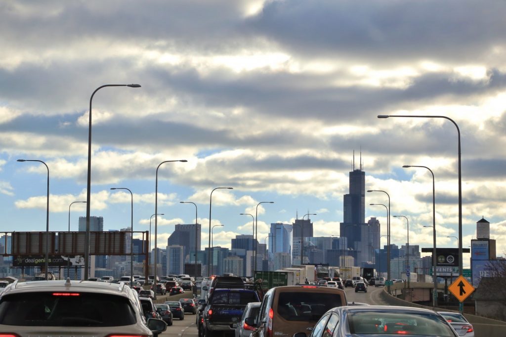
Boston topped this measure – the median home in the metro lost 13.4 percent of its value, about $57,250, when it was shifted 15 minutes from the downtown core. Seattle followed, with the median home losing 11.3 percent of its value ($54,600). Other runners-up included Washington, D.C. (9.4 percent), and Chicago (9.2%).
But unlike the other ranking, hypothetical median home values in many metros – including some we might think of as thriving – actually increase farther from the urban center. In particular, home values in San Antonio and Las Vegas rose a median 14.2 percent and 13.9 percent, respectively, as it was moved 15 minutes farther out. This isn’t so surprising; both cities have relatively inexpensive neighborhoods near their core, flanked by affluent suburbs. We also see a modest 5.5 percent median home value increase in San Francisco associated with a longer commute time, possibly spurred by the high-end housing in farther-flung Marin County and Palo Alto.
Maximizing Bang-for-Buck
Finally, for those looking to best balance a reasonable commute with a relatively affordable home, we identified those areas that permit fast commutes at reasonable prices. Still, even these areas tend to come with unique catches of their own.
The commute “bang-for-buck” index (BFB) is a ten-point ranking of how expensive the median home in a ZIP code is, compared to what might be expected given its commute time to the city center. Higher numbers indicate a deeper discount relative to the metro norm, and lower numbers a higher premium. So, where can you get a deal; and what’s the real cost?
In Chicago, the BFB index peaks in ZIP code 60621, in the city’s South Side. From here, you can make it to the city center in just over half an hour, even at peak traffic. Similarly, if you live in the North Side of Minneapolis, you can pay about $165,000 for a typical home, and make it downtown in just over 15 minutes in traffic.[4]
Finally, in cities with still-depressed city cores like those in Detroit, Kansas City or Baltimore, simply living downtown is the most cost-effective method of minimizing commute times. The downside is that those cores are not as attractive as the centers of other metros, so unless you have a specific reason for being downtown there’s not so much gained by proximity.
As usual, you can’t beat the market, but you can often do better on the margin by hunting for a niche that fits your preferences. Use our interactive tool to find an area that works for you!
Methodology
Before we could investigate the importance of city centers, we had to answer a surprisingly tricky question: what is a city center, and how do we identify them?
We identified a ZIP code that represented the center of each of America’s 34 largest metropolitan areas (by population) using two criteria:
- The number of employees per square mile , using ZIP-level data from the 2016 County Business Patterns dataset from the US Census Bureau;
- The number of inbound trips per square mile for a morning commute, using data provided by HERE Technologies.
From there, we took the geographic center of that ZIP code and identified it as a representative city center.
The results were mostly intuitive. Chicago’s center was in the heart of the Loop; and in Seattle, we identified the area around Westlake Center, just a few blocks from Pike Place Market.
But some metropolitan areas lack such a clear focal point. For example, our method suggested that the center of the Riverside, Calif., metro might be placed in downtown San Bernardino, though other discrete cities in the greater metro area were also plausible candidates. In the Twin Cities of Minneapolis and St. Paul, Minneapolis is clearly the larger and denser city (a historically-sensitive subject), but St. Paul has its own downtown core.
One we identified a core, we combined HERE commute data with Zillow property data to estimate peak commute times to that core for every property in a given metropolitan area.
[1] This part of the analysis excluded both New York City and Pittsburgh.
[2] A simple examination of the median value of “central” (those with a peak commute time of 15 minutes or less) vs “outlying” (homes outside that 15-minute window) homes would overlook a critical factor in helping quantify this tradeoff. Homes are typically not only more expensive in central areas (the median home value in these areas was higher than outlying areas in 23 of 33 metros analyzed), they are also uniformly smaller – the median square footage of central homes was less than outlying homes in every market analyzed. Looking instead at the price per-square-foot of these homes allows us to both accurately assess the commute/home cost tradeoff and compare the effects from market-to-market.
[3] Pittsburgh was included in this part of the analysis but excluded in the aforementioned calculations because of sample size issues.
[4] It’s important to note historical context for these (and likely other) “best value” neighborhoods: Both regions were historically redlined, and low prices today probably reflect to some degree the lasting impact discriminatory lending policies have had in these neighborhoods.


