The housing market is a complicated beast—looking at any single index or trend can mask underlying dynamics in important sub-segments of the market. To help consumers understand the forces at play in the specific slice of the market relevant to them, we segment the Zillow Home Value Index (ZHVI) based on price—dividing it into a high, middle and low tier for each metro area. Using data through November 2013, we have decomposed the market into these price tiers, hoping to bring to the surface important insights into the internal dynamics of the market.
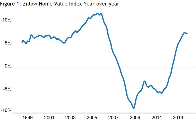
Figure 1 shows the year-over-year percentage change in the national ZHVI. Looking at the figure, it is easy to see the general trend of boom, bust and then recovery that has characterized the housing market over the past 15 years. And while these forces have impacted homes across the value spectrum, Figure 2, which breaks out the differences between the high, middle and low tiers, highlights important distinctions between the experiences of the various tiers.
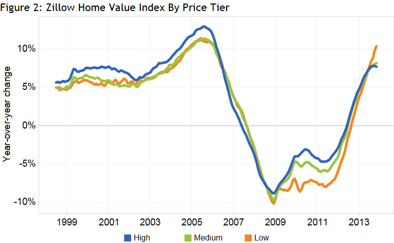
For most of the recent cycle, higher-end homes have fared much better than their lower-end counterparts. As the housing bubbled inflated from the start of 2000 to the end of 2006, homes in the highest tier appreciated faster than the market as a whole, rising roughly 8.4 percent a year, versus 7.3 percent for the middle tier and 7.2 percent for the lowest tier. However, when the downturn came, low-end homes bore the brunt of the fall, depreciating an average of 5.9 percent a year from the start of 2007 to the end of 2011—compared with 4.4 percent for high-end homes and 4.8 percent for middle tier homes.
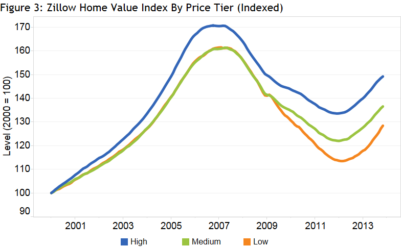
Figure 3, which indexes each of the ZHVI tiers to 100 in 2000, reinforces this point. The high-end tier outperformed the middle and low tiers during the run up in housing prices, but managed to escape the housing recession with smaller losses. Even the recovery has been faster for high-end homes—currently the top tier of homes have recovered almost 54 percent of the value lost during the burst of the housing bubble, whereas the lowest tier of homes have recovered only 44 percent of their lost value. The following table summarizes these price changes.
|
High Tier |
Middle Tier |
Low Tier |
|
|
Peak to Trough |
-21.8% |
-24.4% |
-29.7% |
|
Trough to Current |
11.7% |
11.9% |
13.2% |
|
Peak to Current |
-12.6% |
-15.4% |
-20.5% |
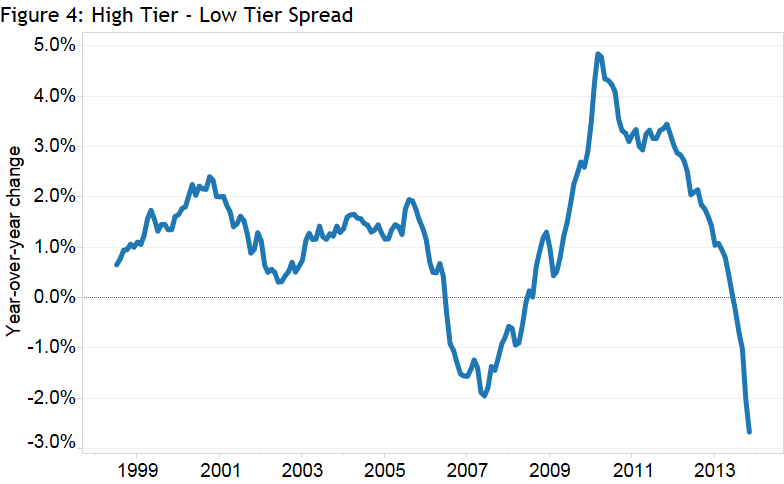
While appreciation over the past 15 years has been much better for higher priced homes than for lower priced homes, there is evidence that the tides are turning. Figure 4 shows the difference in home value appreciation between the top and bottom tiers of home values (that is, the difference between the blue and green lines in Figure 2). As we have discussed (aside from a period around 2007), the high end has generally outperformed the low end. But the last few months have seen a reversal of this trend, with low-end homes recently appreciating much more quickly than their high-end counterparts. Over the last three months, low-end homes have appreciated at an annual rate of roughly 1.9 percent faster than high-end homes (9.6 percent for low-end homes relative to 7.7 percent for high-end homes). If this trend persists, look for low-end homes to make up some of the ground they have lost to the high end over the next few months.
 Drilling down at the individual metro level, we see a similar picture. Looking at the top 15 metros, fully 14 of them have seen high-priced homes outperform low-priced homes since 2000. But 10 of those 15 metros have seen a recent reversal of that trend and are currently experiencing stronger appreciation for low-end homes than they have for the high end of the market.
| Metropolitan Area | High Tier Appreciation since 2000 | Low Tier Appreciation since 2000 | High Tier November YoY Appreciation | Low Tier November YoY Appreciation |
| New York | 84.7% | 64.8% | 7.25% | 4.99% |
| Los Angeles | 113% | 112% | 15.7% | 23.9% |
| Chicago | 28.7% | 1.98% | 9.88% | 9.36% |
| Dallas | 39.4% | 17.2% | 4.13% | 4.82% |
| Houston | 45.3% | 38.2% | 6.64% | 4.32% |
| Philadelphia | 66.0% | 67.5% | 4.88% | 1.88% |
| Washington | 109% | 70.8% | 7.32% | 10.3% |
| Miami | 91.1% | 32.5% | 14.4% | 23.2% |
| Atlanta | 23.3% | -25.4% | 13.5% | 16.3% |
| Boston | 65.6% | 58.2% | 8.27% | 9.01% |
| San Francisco | 93.4% | 64.7% | 16.6% | 31.0% |
| Riverside | 86.2% | 72.2% | 24.6% | 30.5% |
| Phoenix | 63.8% | 32.0% | 8.11% | 22.7% |
| Detroit | 3.13% | -41.9% | 16.3% | 8.83% |
| Seattle | 66.2% | 33.9% | 10.1% | 13.4% |
