Fun With Data: What’s the Mission Status of Your Neighborhood?
It’s difficult to quantify the difference between a housing market that’s metaphorically “taking off” and a market that has (so far) “failed to get off the ground.” One approach is to compare home values in both dollar terms and their recent growth.
Expanding on the space travel analogy in the figure below, stratospheric markets are places where home values are both high and growing very quickly, while markets that have failed to launch are places where home values are both relatively low and growing slowly (or even declining). In between these two extremes are markets where home values are relatively low but growing quickly – the so-called “rocket ship” neighborhoods – and markets where home values are high but growing slowly or falling, which we term “coming back to Earth.” We’ve also included a gray area for neighborhoods with growth that’s “somewhere in the middle.”
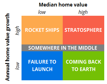
To help explore these trends in different metro areas, we created a tool that allows users to compare the mission status of various neighborhoods in their communities. It’s a simple approach, but it can provide a good gauge of the market, both currently and over time.
By default, the tool shows Seattle in 2014 Q3. The high-growth neighborhoods tend to be closer to the urban core: Lower Queen Anne, Denny Triangle and Downtown Bellevue are all stratospheric, while Westlake, Belltown and First Hill are rocket ships. Many neighborhoods that are further removed from the main, central city in a metro have failed to launch – for example, neighborhoods in the city of Tacoma, roughly 35 miles south of the larger city of Seattle.
Neighborhoods that locals tend to consider high-growth – like Capitol Hill, Wallingford and Fremont in Seattle – actually fall into the gray or low-growth zones. This isn’t a fluke: Capitol Hill and Wallingford had lower-than-median growth in at least half of the years from 1997 to 2014, while Fremont had lower-than-median growth in half of the years in the past decade.[i]
What goes up often comes down, so play around with the year in the tool to see how the mission status of neighborhoods in your community have changed over time. For a more detailed explanation of the methodology, see the paragraph in the bottom panel of the tool.
Enjoy!
[i] Weighted by population and including available neighborhood data only.
Sign up for Zillow Research updates
Subscribe to receive weekly emails for the latest Zillow research, weekly housing data, market insights and more.
Related Articles



Research in your inbox
Get the latest housing data and analysis from Zillow's economists — delivered when the numbers update.

