The events in Ferguson, Mo., over the past month have prompted a national conversation about race, with several commentators pointing to the degree of racial segregation in St. Louis as important context to the situation there.
On the heels of our recent report, A House Divided – How Race Colors the Path to Homeownership, we analyzed the degree to which racial segregation might be tied to changing home values in America’s metropolitan areas. We examined the relationship between changes in segregation [1] and changes in home values between the years 1990 and 2010. To measure the change in home values at the metro level, we used the Zillow Home Value Index chained back to 1990 using the Federal Housing Finance Agency’s Home Price Index.
To measure segregation, we used US2010’s Dissimilarity Index. This index measures the relative separation of two groups within a metropolitan area. If the white-black dissimilarity index is 50%, this means that 50% of blacks (or whites) would need to move for there to be no segregation between the two. Since most metros have more than one minority group, we focused on the degree of segregation for the largest minority in a metro[2]. On average, racial segregation has decreased over the past two decades. But the experiences in different metros have been radically different.
Below is a list of the five metros where segregation has increased the most, and a list of where segregation has decreased the most, as measured by percentage point change using the Dissimilarity Index.
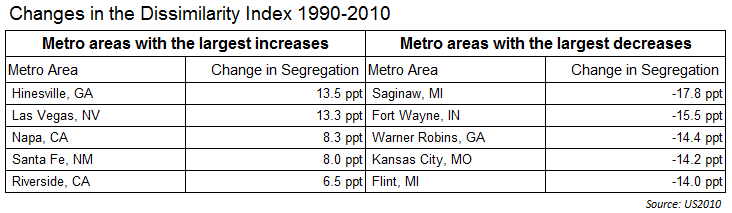
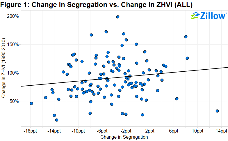 Figure 1 shows the change in segregation versus the percentage change in the local Zillow Home Value Index (ZHVI). While there is a positive correlation between the two, implying that areas with increasing racial segregation experienced faster home value growth, the relationship is not very strong.
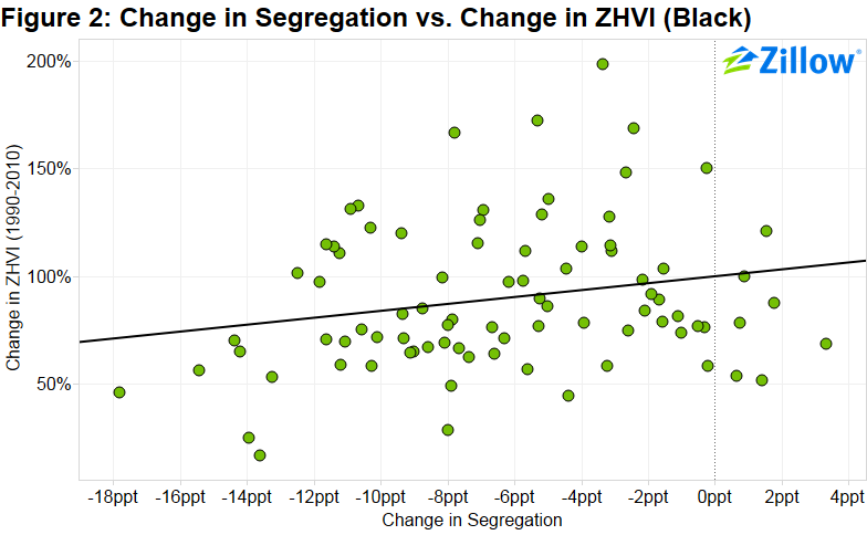
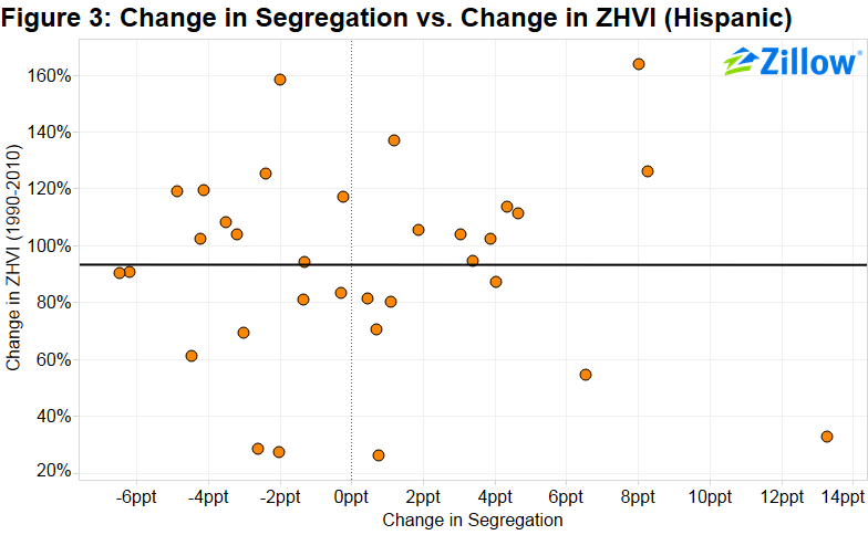
In order to get a clearer picture, we sorted metros by their largest minority population. Figure 2 represents metros where the largest minority group is black, and Figure 3 represents metros where the largest minority group is Hispanic. Interestingly, the correlation observed in Figure 1 appears to be primarily driven by metros in which blacks are the largest minority. There is little to no correlation in metros where Hispanics represent the largest minority, but a more clear correlation for cities where blacks represent the largest minority.
It’s difficult to tell from this analysis what is causing these relationships. This could be a story of gentrification – perhaps rising home values in these metros are causing lower-income groups to move out of otherwise integrated neighborhoods, increasing racial segregation. Or, racial segregation might be pushing values higher. Nobel Prize-winning economist Thomas Schelling has suggested that a small preference for living close to people of the same ethnicity could lead to increased segregation, and potentially higher home values. There are a number of different possibilities.
[1] Metros with small to moderate population of the largest minority were excluded from this analysis.
[2] Metros where largest minority has changed from 1990 to 2010 were excluded from this analysis.
