There is great joy in doing the wrong thing for the right reasons when it works and no one gets hurt. That’s how things went with our new charting web service, Paparazzi Charts.
Charts are a really important part of the content on Zillow. We generate a lot of complex and interesting data about homes, and charts help our users visualize and understand it. One of our most important metrics is the Zillow Home Value Index (ZHVI), which is used throughout our services, and has also appeared in several academic studies and Congressional testimony. Here’s an example chart of the Zestimate of a home, the ZHVI in the zipcode, and the ZHVI in the city, over time.
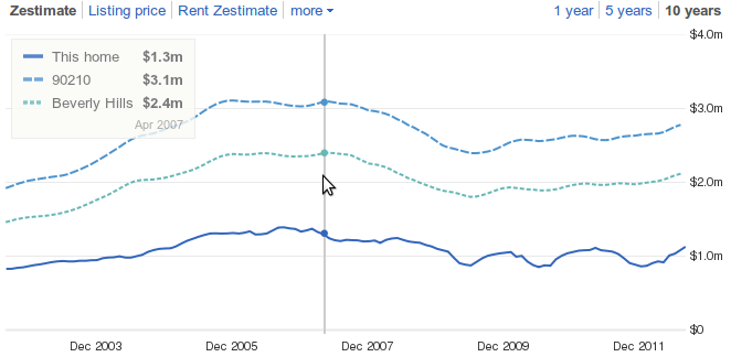
Zestimate and Zillow Home Value Index over time
Over the years, we’ve experimented with several approaches to putting charts in the browser, ranging from pure server side rendering, to Flash, to cross-platform Javascript. In the end, we’ve settled on a hybrid implementation that optimizes for both speed and interactivity. Here’s how it works. First, we render a chart on the server as a PNG. Then, when the client downloads that PNG, we use a bit of Javascript to create interaction on top of the PNG.
The reason this works well is that we do the heavy CPU lifting on the server side to render the chart, using a Javascript charting library. Client browsers can request just the PNG of the chart for the smallest possible payload or grab a JSONP (http://www.json-p.org/) response that contains both the chart image and interaction meta-data in the same payload. A tiny 20KB client side script can grab the JSONP version and layer a scrub line and legend on top to provide basic client side chart interactions.
Drawing charts server side is a little odd these days. Drawing charts on the server side using Javascript, then returning the result as a PNG is just plain weird. But, it’s a good kind of weird.
Why Paparazzi Wins
When we tested our new charts against our old ones, our users ended up engaging with Zillow ~7% more. Why? People love speed.
One of the biggest factors in making Paparazzi fast was size. Javascript size is really important for several reasons. More Javascript means a longer download. It also means more CPU burn on the client to parse the Javascript. And, eventually, there’s more CPU burn to render the chart client side. That’s particularly important on mobile platforms.
When all was said and done, the Paparazzi chart image and meta-data needed for interactions fit in about 50KB. We jammed the light-weight interaction layer into an additional 20KB of non-cpu intensive Javascript. That’s it. In contrast, let’s look at some nice client side charting libraries. Keep in mind that these are extremely flexible libraries that let you build all kinds of charts, whereas what we were looking for was a hyper-optimized solution for one particular type of chart.
Out of the many great client side charting libraries, we’ve looked at Dojo charts, YUI charts and D3.js in depth. As I write this, the awesome D3.js library weighs in at 114KB of Javascript, and it’s one of the smallest libraries available. It takes some shortcuts to stay light, though, like skipping IE 8 support and providing limited capability on Android prior to Honeycomb. Still, it’s five times larger than the Paparazzi chart Javascript layer. YUI and Dojo charting both weigh in at about 200KB (with IE 8 support), and Dojo has the drawback that two round trips are needed for it to do browser detection and choose between Canvas/SVG/VML graphics layers.
Zillow engineers have created some internal tools that help us build great infographics to describe these kinds of size differences :).
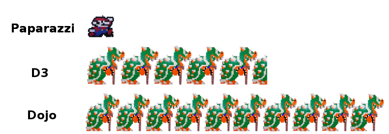
Paparazzi Size Infographic
Keep in mind that these are just the base sizes – it takes another 20KB of Javascript to instantiate the chart, style it, and give it the data points it needs to render.
Backstory
Long before Paparazzi, we had a Flash charting layer. That wasn’t the best thing for our users for several reasons, including the lack of Flash on mobile devices. We started looking for a Javascript replacement that supported Android, IOS and IE. That turned out to be difficult because early Android does not support SVG or VML. So, we had to have a charting engine that would render to Canvas, SVG or VML.
We staged a shootout across libraries that could render to all three platforms. Dojo charts were the most functional and performant option for our use case. So, we implemented our charts in Dojo to get rid of Flash charting. It had a few quirks that we didn’t like, though. It was more difficult to style than Protovis or D3.js, the charting layer was pretty heavy, and the second round trip for browser detection slowed it down a bit.
We launched Dojo charts as a test, to collect some real-user behavior metrics. Our users got a little happier without Flash. Downloading and running 200KB of Dojo blocked a little less, and burned a little less CPU than starting up the Flash plugin and running our Flash charting code. We knew we could do better.
Shrinking the Payload
It was obvious that the Javascript payload needed a trim to perform on mobile. We thought about taking a hatchet to the chart layer to rip out chart types that we didn’t use. But after digging a bit, we didn’t find big enough lumps of unused code to make that worthwhile. It looked like server side rendering was the only way out, at least on mobile.
At first, we needed to verify that server side rendering would actually help, since the image might be larger than the Javascript payload. Needing a bench test, we took a screenshot of the rendered chart to see how big it would be, and found that it was pretty small. Then someone said, “hey, we should just take a screenshot of the page on the server side and return it.” That was pretty funny. Someone else found a screen cast on automating a webkit browser through Python. Then … things got a bit out of hand.
It took an hour to write a script that could take PNG snapshots of any web page. We put that inside a Turbogears web service. Charts started popping up all over the screen on the dev box. So we launched Xvfb, a headless X server implementation, to clean that up. I’d like to tell you that was as far as it went. I’d really like to tell you that we stopped that nonsense and made our Dojo 1.6 charts work on node.js, using minidom and node-canvas. Come to think of it, pretend that’s just what we did.
Whatever we did, it’s rendering most of Zillow’s chart traffic on 40% of an old server, with rock solid uptime.
The Wrong Thing
If you do happen to use Python to run a Webkit browser as a Turbogears web service, rendering to Xvfb, there are a few gotchas to avoid. Or, so I’ve heard. Don’t run WSGI in threaded mode, or mod_python. Spawn processes for better failure isolation. And be sure to use the WSGIServer implementation from flup.server.fcgi_single. The python/gtk eventing bridge really doesn’t like thread hopping and will deadlock on you. Also, use this code to start and stop an Xvfb instance per process.
Good luck, have fun and stay safe!
