In recent years, inventory has fallen to historically low levels, reaching a national seasonally adjusted low of 1.28 million homes for sale down from 1.97 million homes in April 2011 – a 53.2% drop. Much of this drop can be attributed high levels of negative equity, locking homeowners into their homes. While inventory has rebounded slightly in most markets, as negative equity declined, nationally inventory remains low. In fact, of the top 50 metros, only Hartford, CT has returned to peak inventory levels as of June 2014 and 38 of the top metros are more than 30% below from their peak inventory levels in 2010 and 2011. For those ready to buy a home, limited supply can lead to a challenging buying experience with few options, potential bidding wars, and quick selling times. These are especially challenging conditions for first time home buyers, as they are often not as competitive as all-cash buyers or investors.
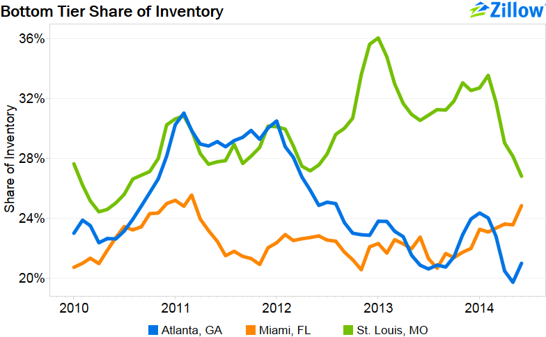
While overall inventory remains suppressed, in many markets the bottom tier is particularly underrepresented. Inventory tier cut points are determined by breaking up the housing stock into thirds by home value. Thus, the bottom tier share of inventory is defined as the proportion of listings at or below the 33rd percentile of home values. In Miami, the bottom tier of homes has represented less than 26% of available inventory since 2010; Atlanta has seen the bottom tier’s share drop nearly every month since the start of 2012; St. Louis bottom tier inventory recently fell below 30%.
Other markets have a more equal share of inventory, though it is a rare metro where the top tier of homes has not been the dominant share since 2010. Indeed, in all of the top 50 metros except New York, Columbus, and Honolulu, the upper tier has held a larger share of inventory than the bottom over half of the time since 2010. In 25 of these markets, such as Chicago and Denver, the upper tier has always held a larger share than the bottom tier. The reverse is never true.
Given the state of the real estate market since 2010, it is difficult to gauge what the normal inventory composition is in these markets. We would expect the available inventory composition to match housing stock, but it will be interesting to see if this does indeed happen in more markets moving forward. As discussed in this recent post, while negative equity rates have eased overall, persistently high negative equity in the bottom tier is likely suppressing available inventory in that tier, skewing the composition. In general, while home shopping right now is difficult due to suppressed inventory, those shopping for home in the bottom tier will have a particularly difficult time until more of these homes come to market.
Methodology
For-sale inventory is defined as the number of homes for sale on Zillow, with further details available here. To count inventory by tiers, cut points are defined as the 33rd and 66th percentiles of Zestimates within a metro. These cut points are recomputed monthly with the release of the new Zillow Home Value Index (ZHVI) value. The share of inventory is the share of the non-seasonally adjusted inventory value. The inventory time series, both seasonal and seasonally adjusted, as well as ZHVI and ZHVI by tier is available for download on here. All data referenced above is current as of June 2014.
